1K Blog Marathon: Day 61
From the analog days and pixels, even before Xerox started the use of UI, to the rise of skeuomorphism, where real-life objects are used as digital objects mimicking the original look and feel, we are now in a flat world – at least in design concept (I’m not a flat-earther). When mobile use is at the peak, this minimalist approach dominates the User Interface world, and more and more software, websites and apps are migrating into using Flat Design. Let’s take a more flat approach on this one!
How Flat is this Design?
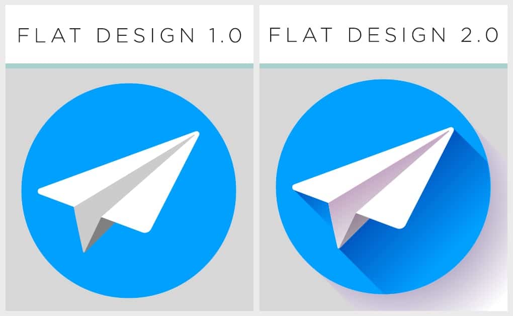
Flat Design is a drastic response to mobile apps design. It replaces the skeuomorphism, or the imitation of real-life objects, like toggle button (buttons), paper (note canvas), and even camera (for camera apps). Flat Design removes the noise from this design, removing shadows, gradients, and lights – only leaving flat opaque color. This approach is quickly supported by many designers and developers worldwide.
History
Despite the trendy feel of this design approach, Flat Design started as early as 1920s, influenced by the International Typographic Style (a.k.a. Swiss Style) emerging from Russia, Netherlands and Germany. This is further developed by designers in Switzerland on 1950s.
In digital world, Microsoft released Windows Media Center (2002) that shows a glass-like effect / holo, also seen on Windows Vista and further in Windows 7. Although not fully flat, Apple followed this trend in their iOs 7 in 2013, which showed flat UI using brighter colors (removing shadows). Translucent and blurred designs is also rising in these dates.
The Sharp Edge of the Flat
Many developers and designers try a more radical flat design, removing altogether the shadows, gradients – to the point that the flat button doesn’t look like clickable anymore. Many apps that follows this trend overuse the flat design without proper research on their end user. As a result, many users are frustrated by the updates (for old apps that overhauls its design) or lost without any clue or idea what to do next (for new apps that jumps in quickly). This is when Google released their own design, called Material Design (for Android). This approach uses light shadows, with the application of animations that mimic real-object movements like bounce, lift, hover, press, etc.
Take note that the use of smoother animations, pan and drag, and laws of Physics dominate the gaming industry designs – just look at Angry Birds!
Flat 2.0
The new flat, “semi-flat” or “Flat 2.0” became popular in response to the totally flat and boring flat approach. It uses long shadows, one or two shade darker than the original color scheme of the design. Although pleasing to the eye, this long shadows really do nothing to help users distinguish buttons from text boxes. It doesn’t help the app, but it adds aesthetic to the design overall.
Neumorphism: Another Design for Disaster
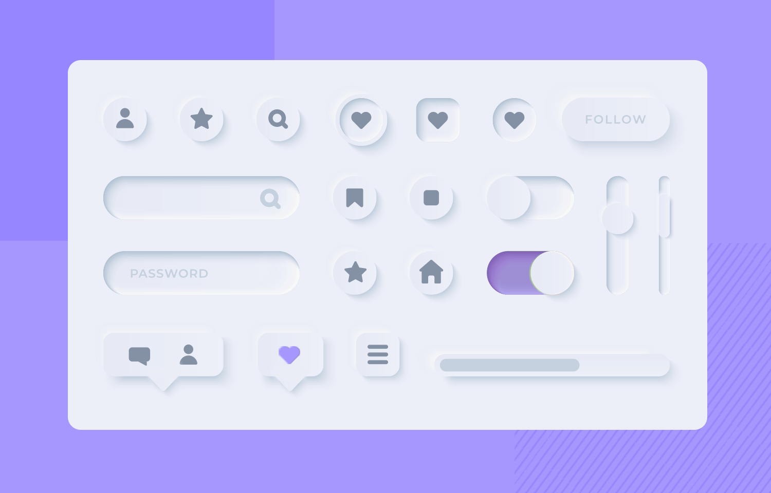
There is a new hype in the design world that aims to replace Flat 2.0, called Neumorphism (yeah, the context clue is “Neu”, which sounds “new”). This approach uses very minimal colors, usually darker or grayish, compared to flat that is lively using bold bright colors. This new design still applies flat approach but with the extreme use of shadows and lights. It has a feel that an object (button, textboxes) are either embossed or engraved. For me, it looks like there is a thin white deflated balloon covering a button, then stretched to emboss the button, IMHO.
Whatever design style you are using, focus on delivering a better and pleasing UI but don’t sacrifice the UX, or the User Experience. UX is the most important objective of a design. Design is not only the colors and the balance and the art of the interface, but how the user respond to it. Design is how it is functioning. It says “It was designed for this job”, not “It was just designed”. Always take into consideration you end user.
“And that’s one blog, stay hungry!”
Design is not just what it looks like and feels like. Design is how it works.
Steve Jobs
Disclaimer:
Images used here are owned and copyrighted by their respective owners. I do not own or take credits for images with “source” on its caption.


Leave a comment